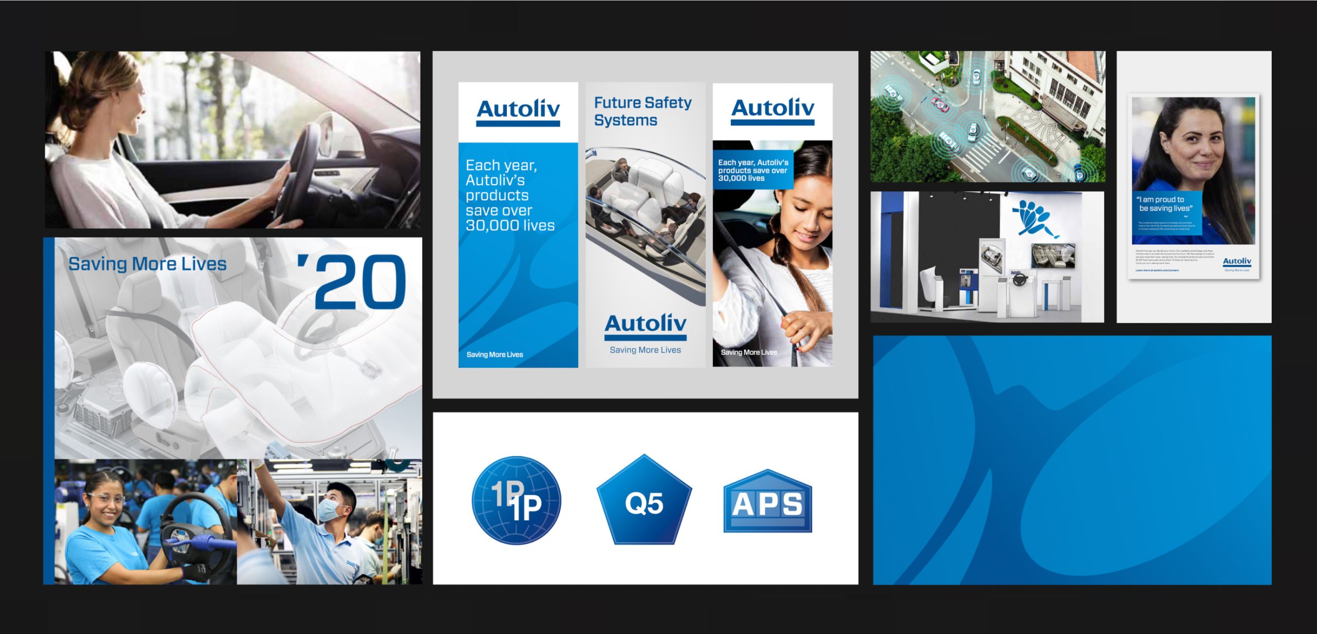
Autoliv came to Valtech Radon with a pitch request to update their brand to better reflect their innovative spirit and position as one of the world’s leading companies within mobility security products.
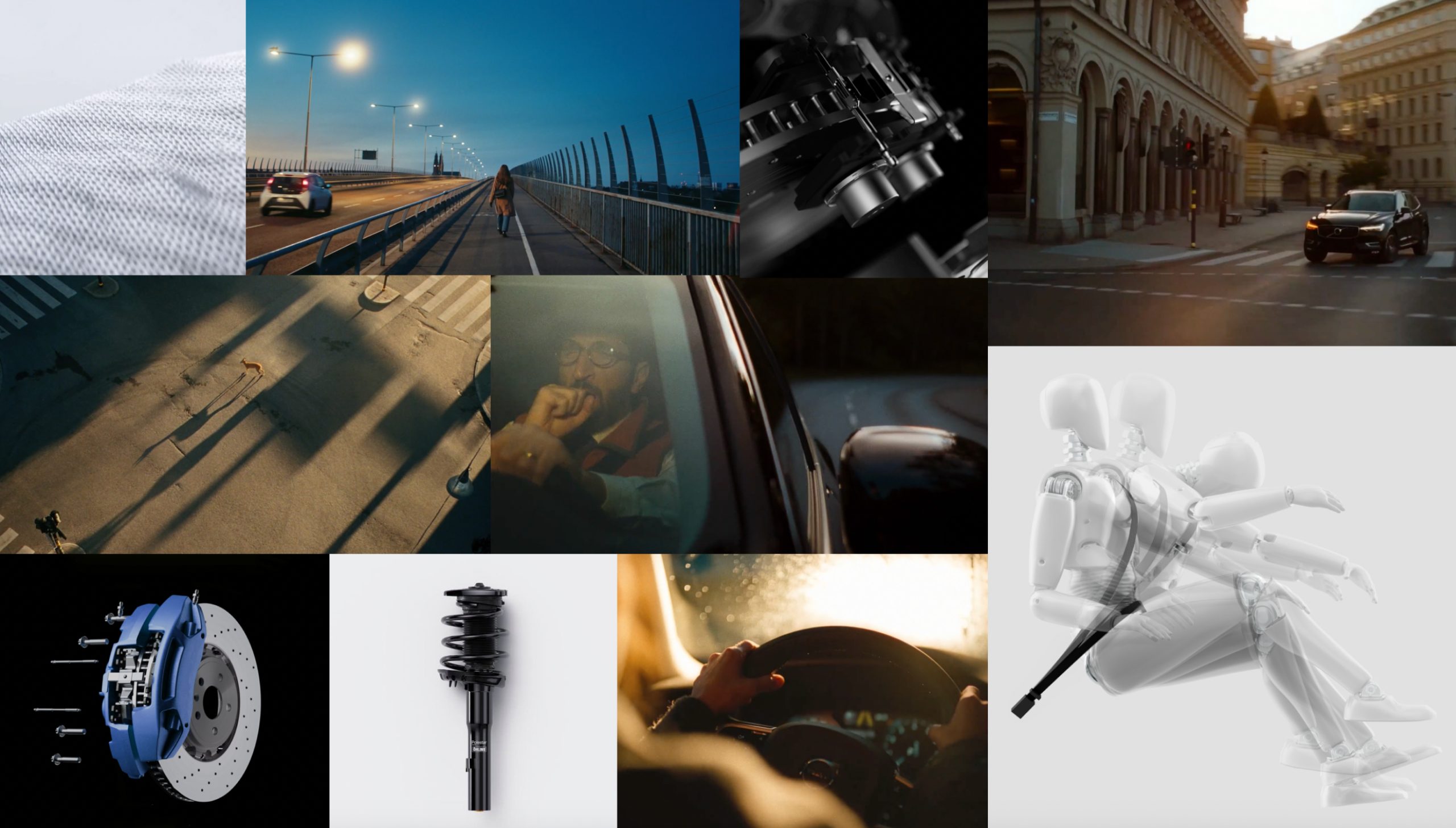
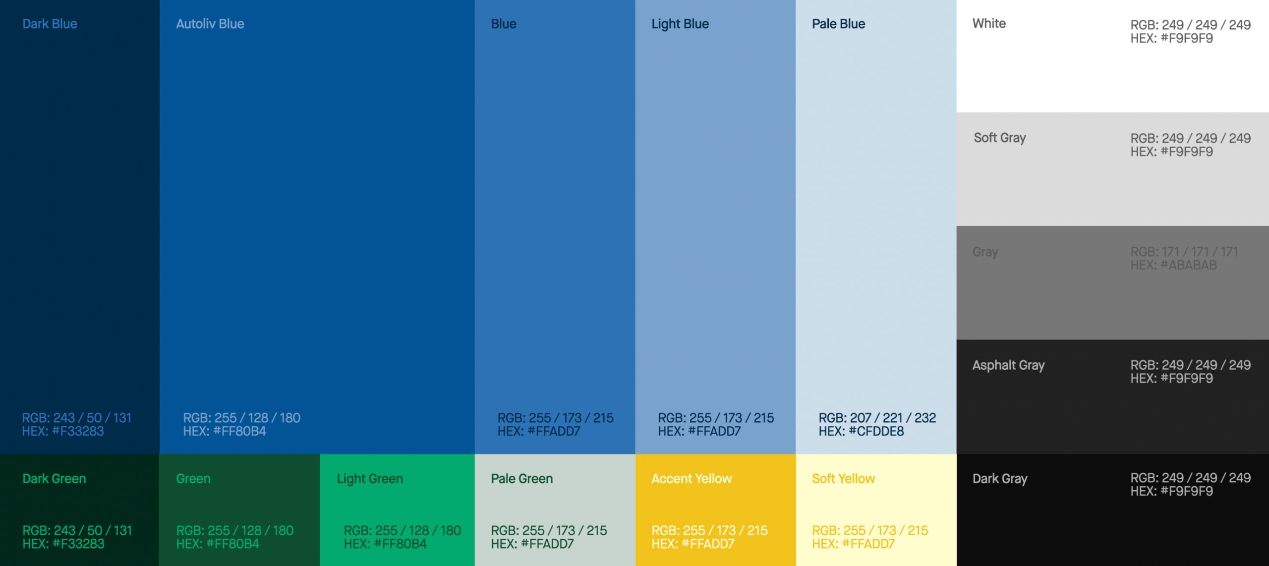
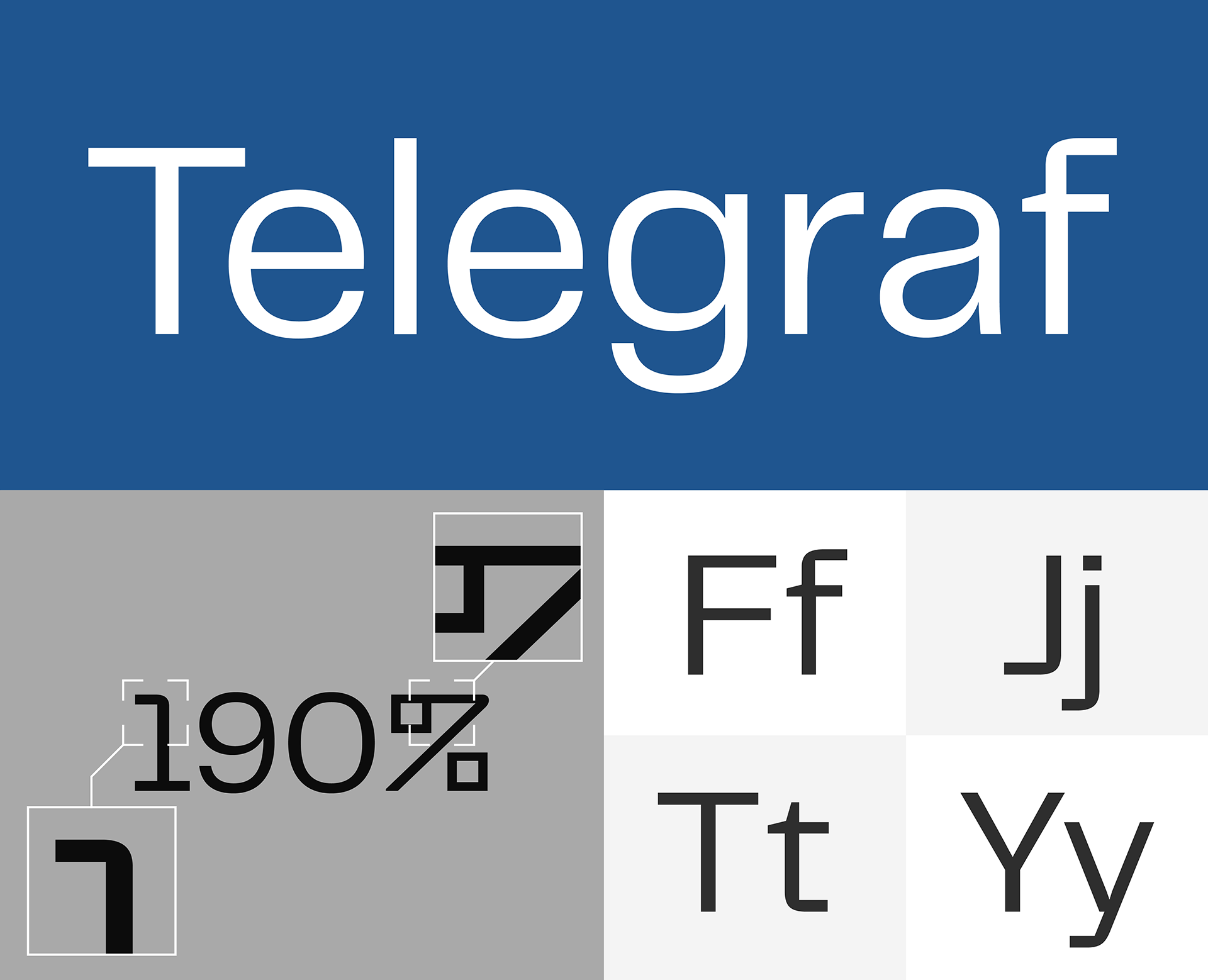
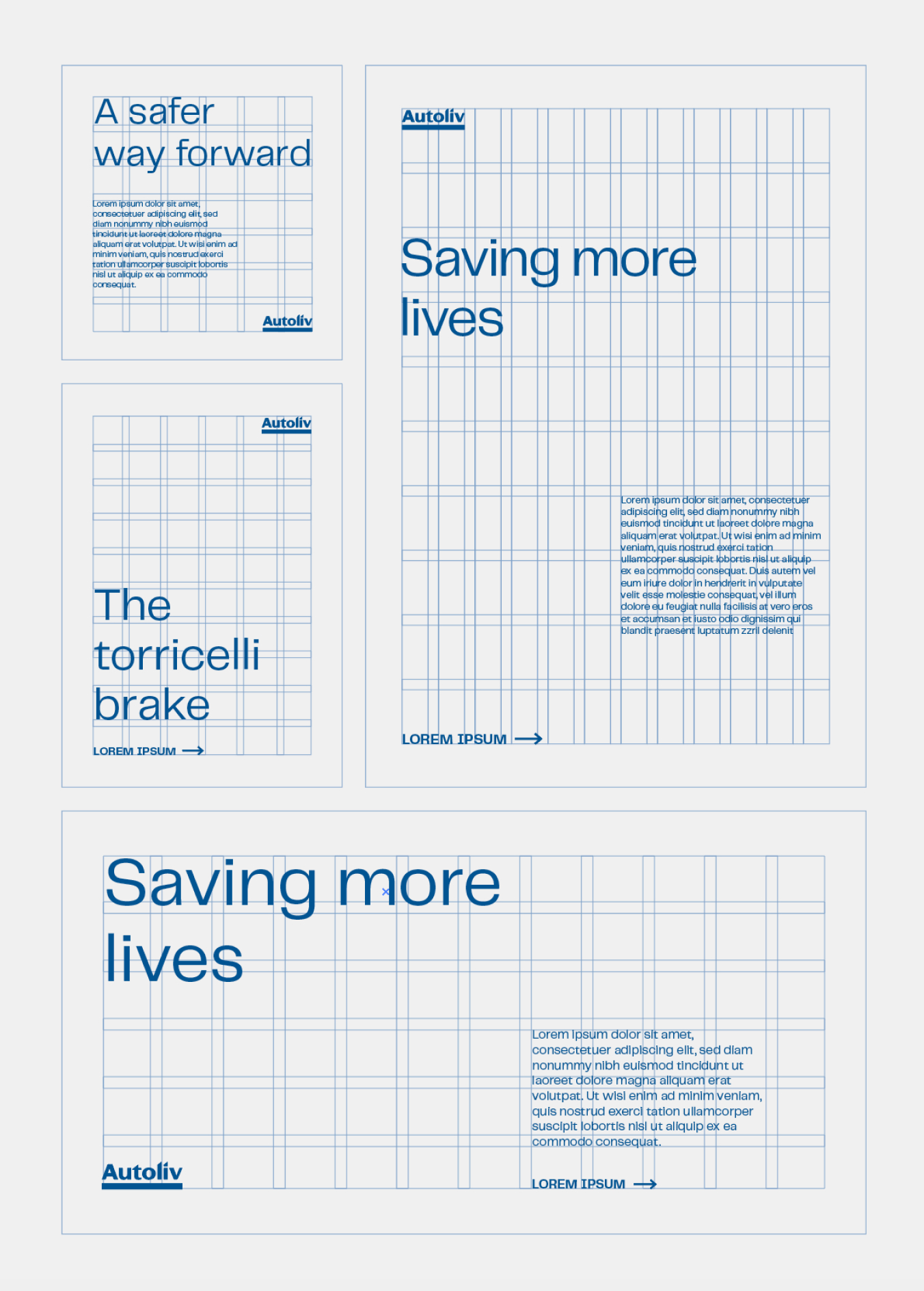
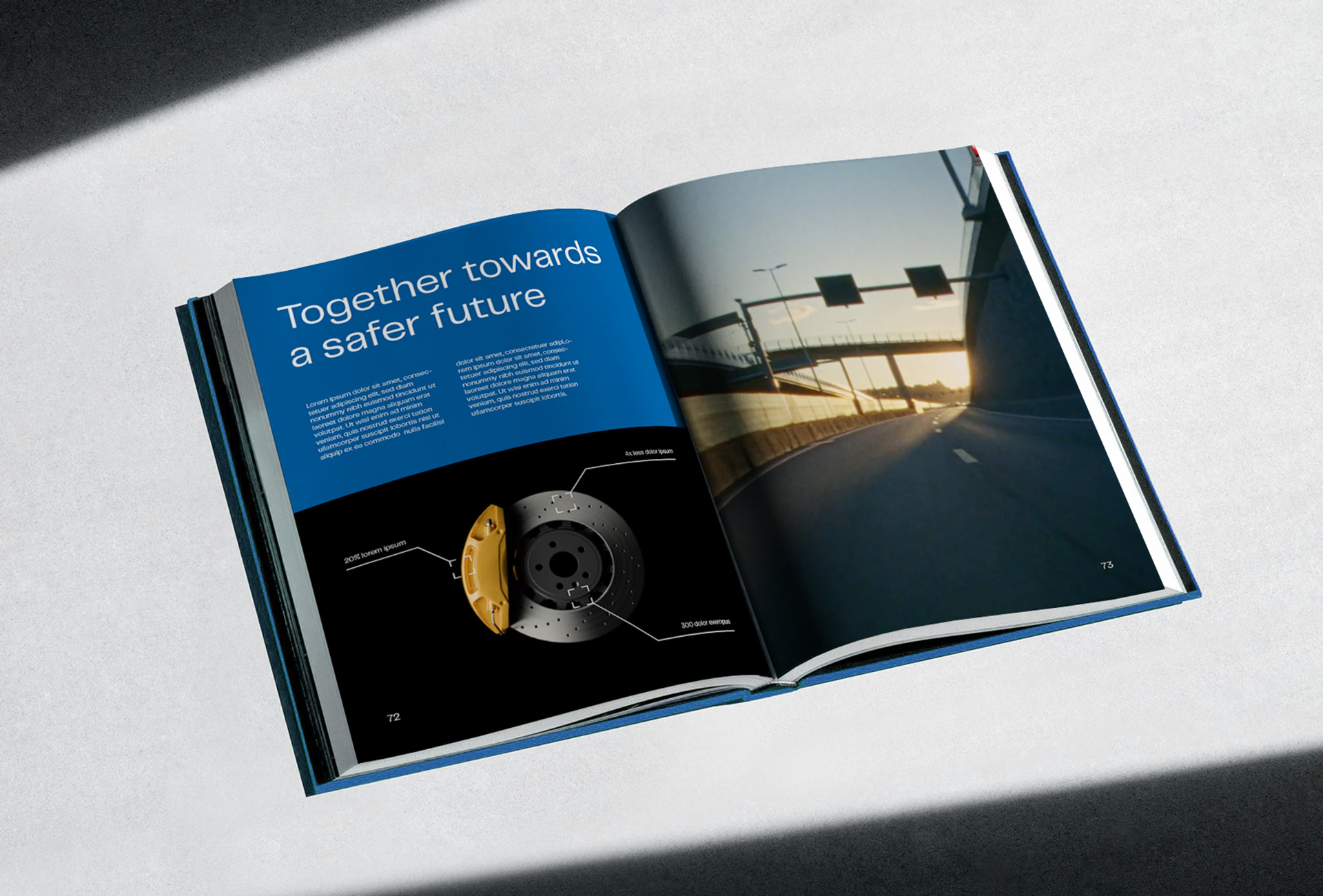
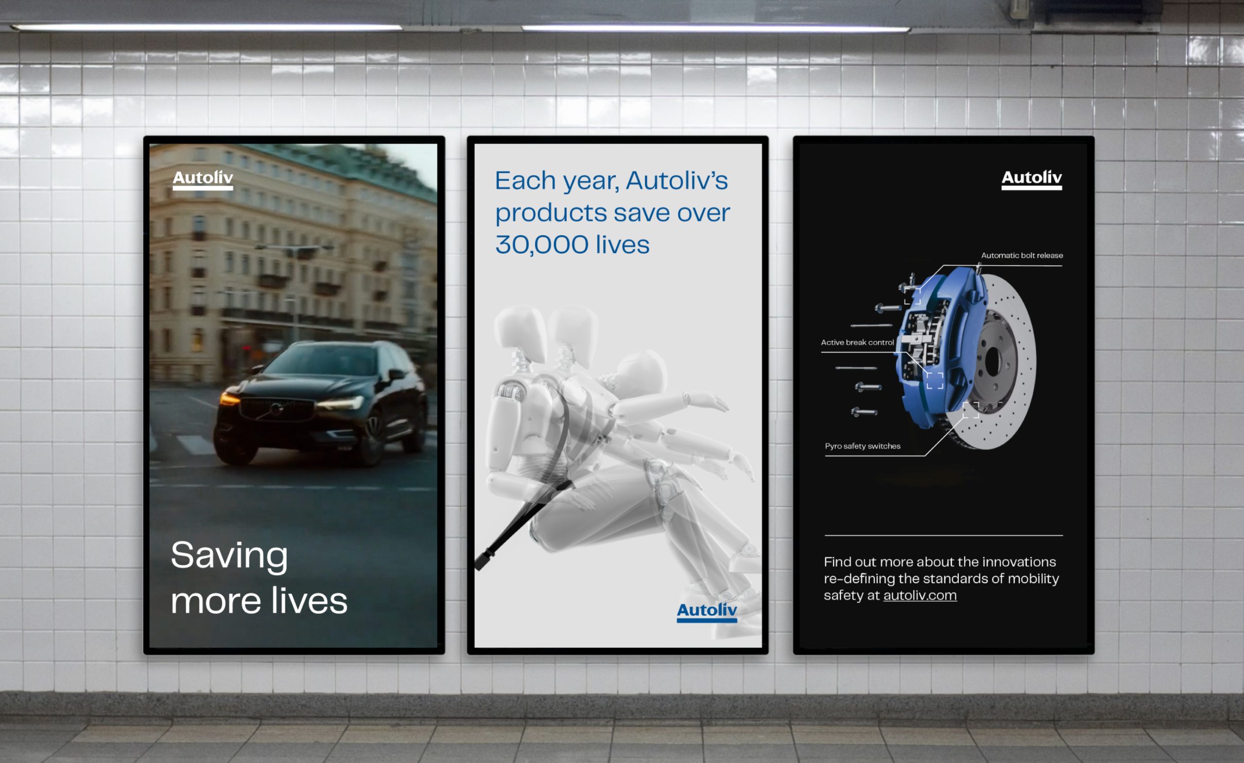
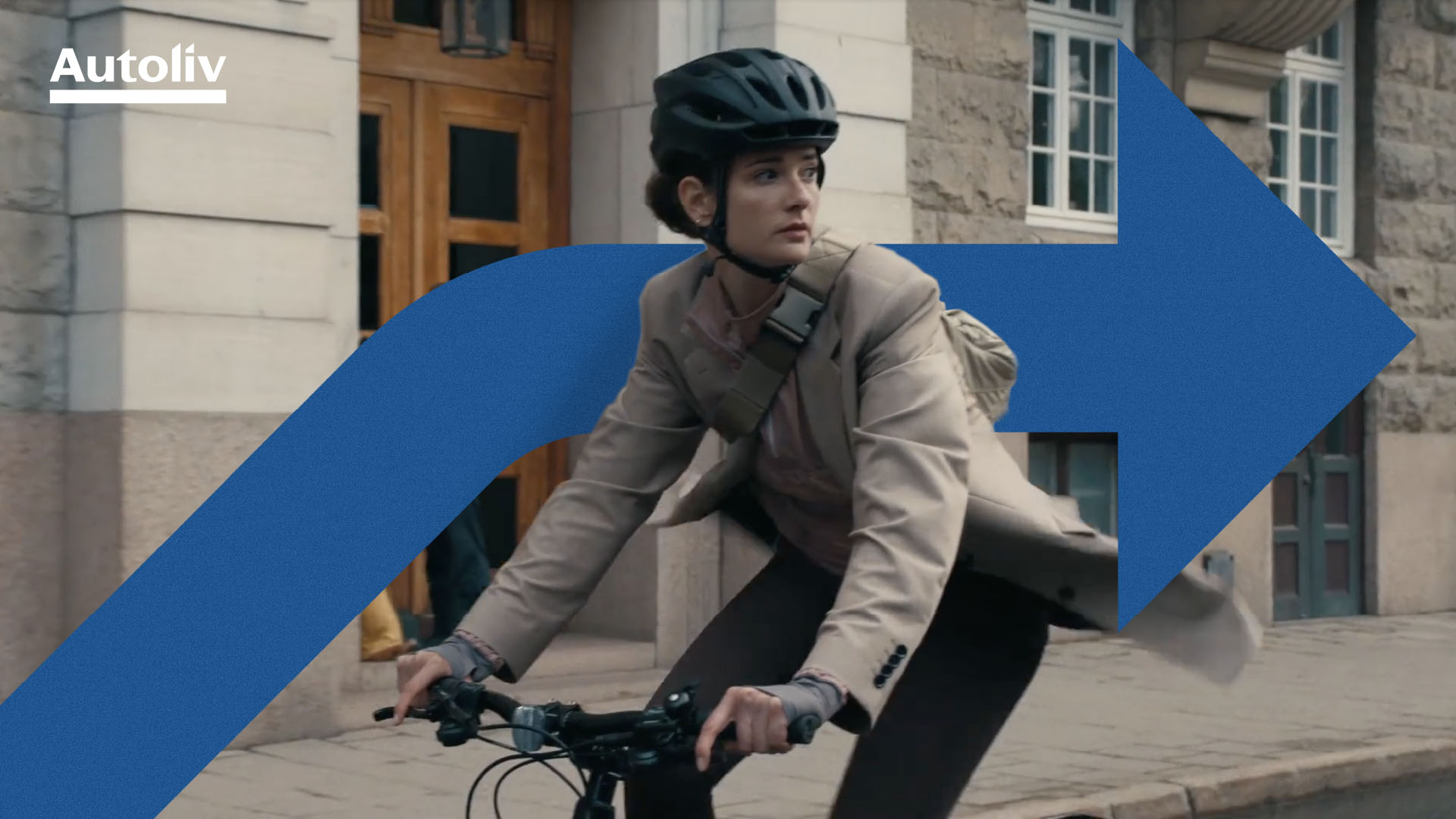
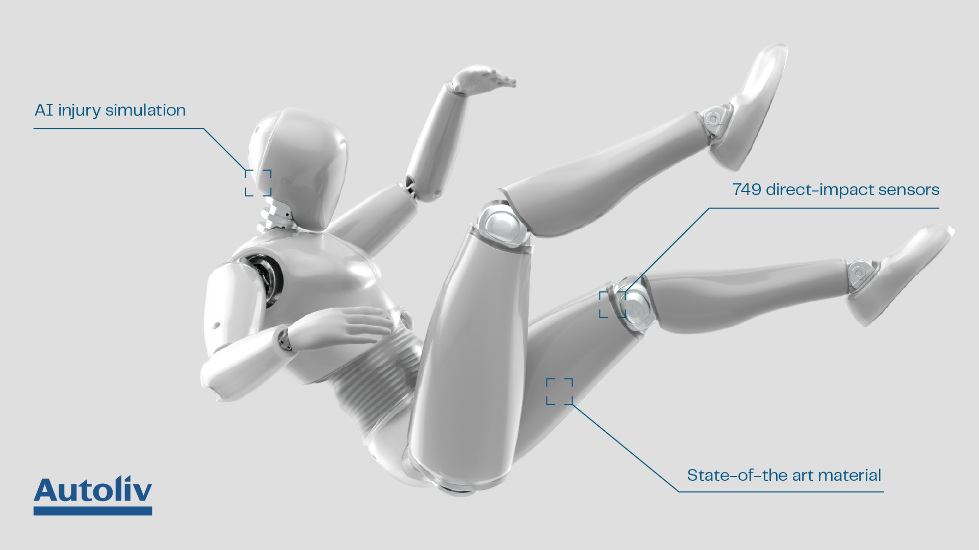
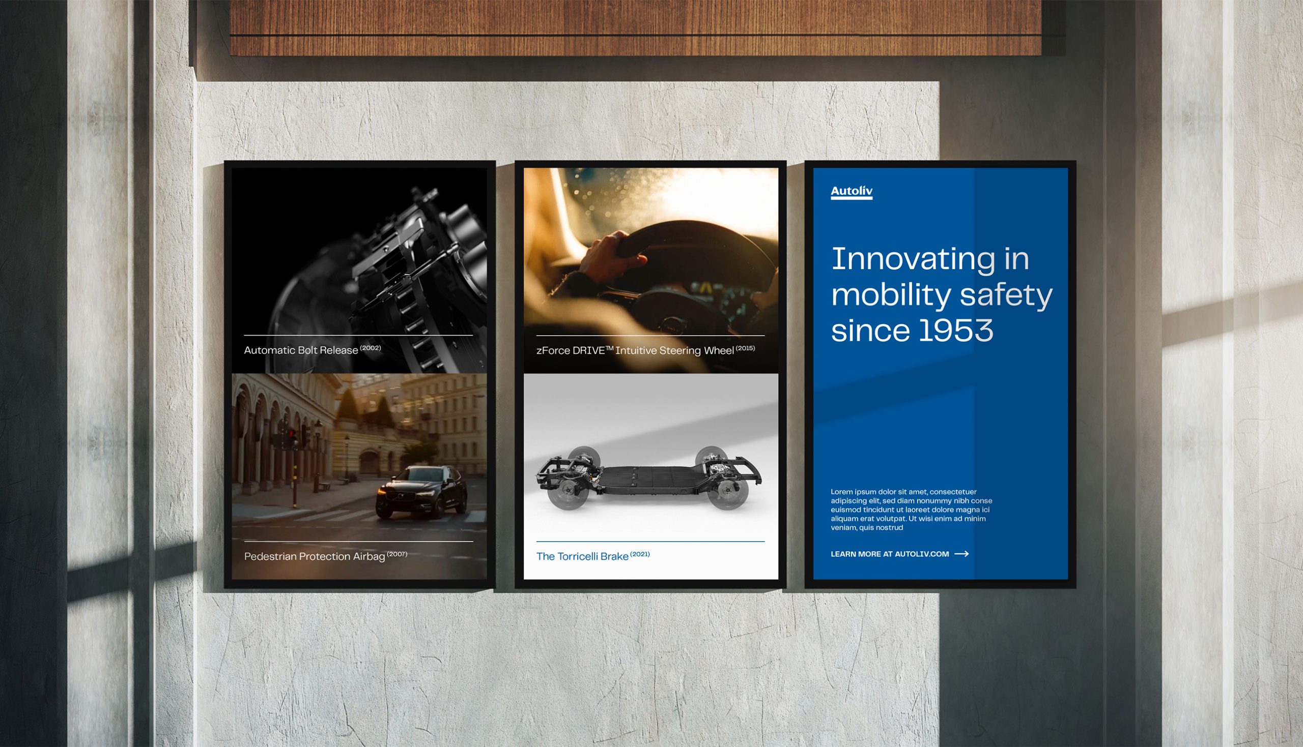
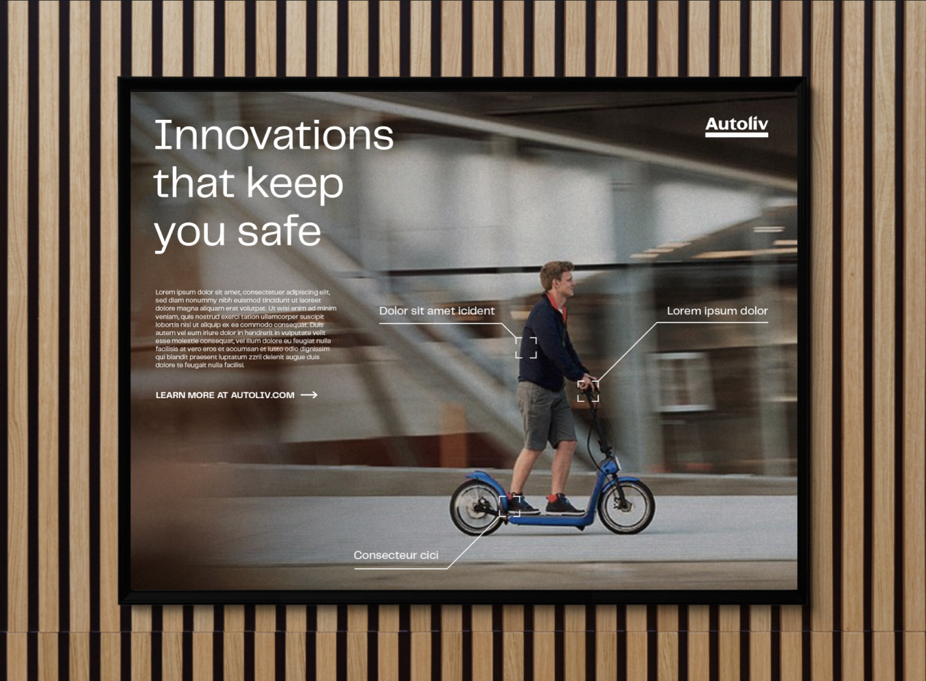
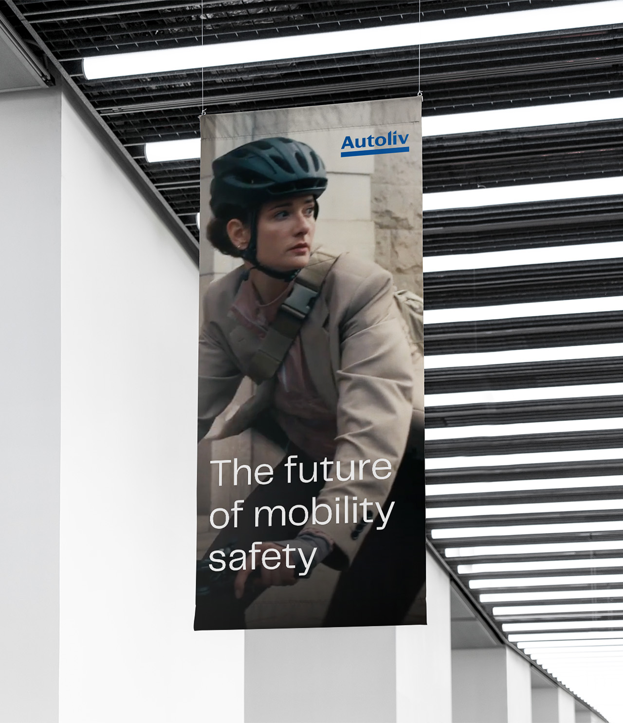
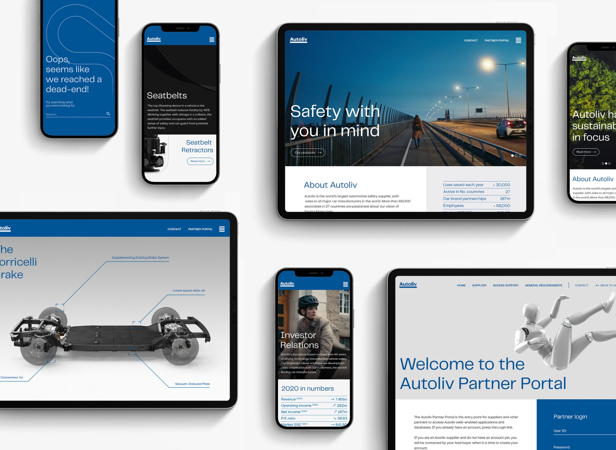
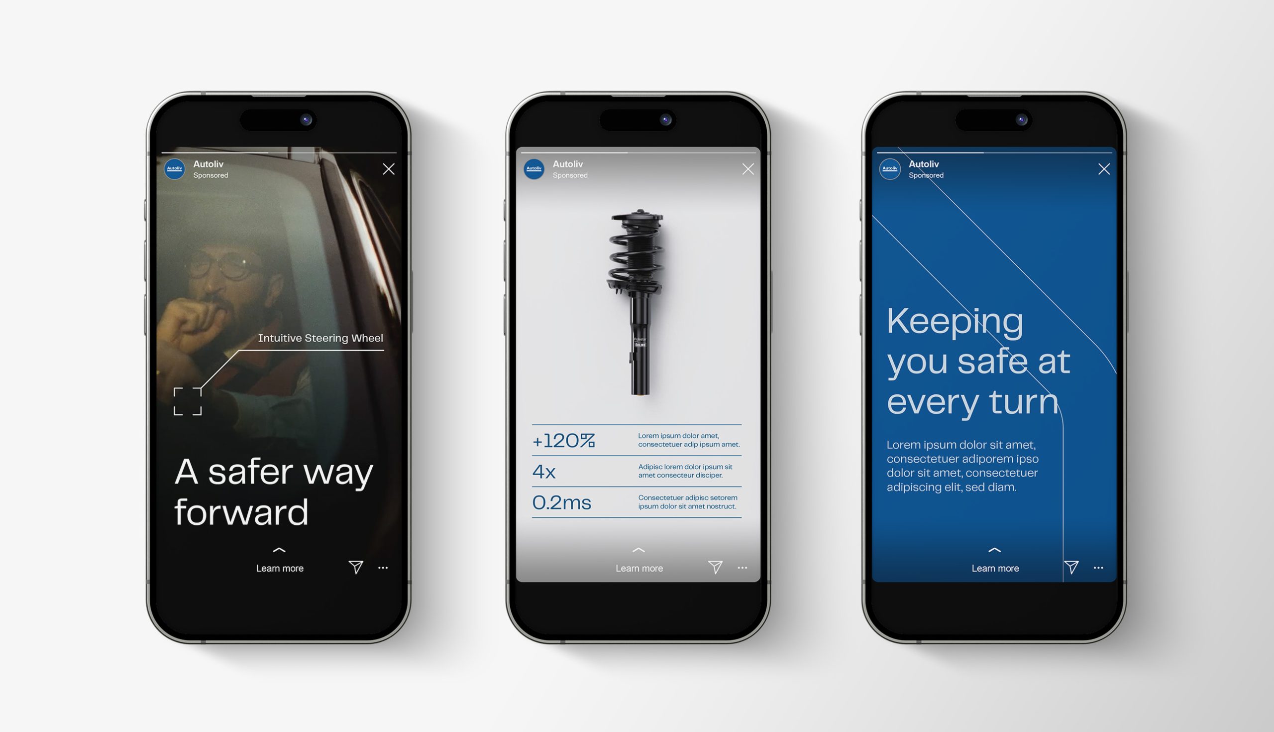
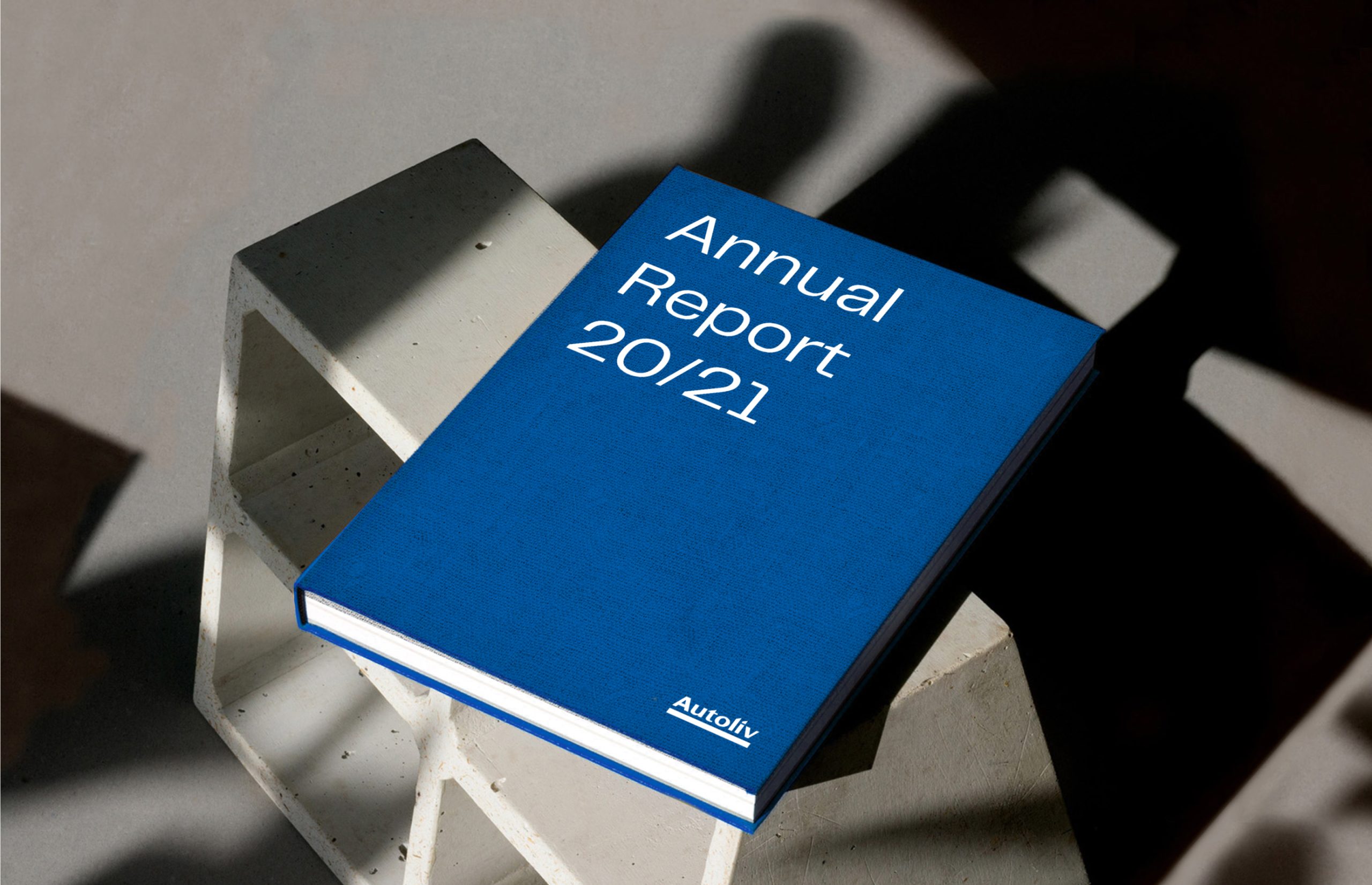
With the new identity, I wanted to establish Autoliv as a modern-day tech company. I developed a new imagery world, with a contemporary 3D-approach where they could highlight their product innovations and features, along with a photography style that was warm, human and documentary. For the photography, I wanted to show real people in traffic situations where Autoliv delivers on their brand promise ”Saving more lives”. New brand elements where also introduced, such as patterns that blend the curves of dwindling roads with the sharp geometrical patterns of electronic circuits, and a new brand typeface Telegraf, that combines the timeless forms of mid-century grotesks with rigid angles and curves, giving a distinct and innovative look in large sizes, with great legibility in smaller ones.
My role
- Branding & design
- Art direction